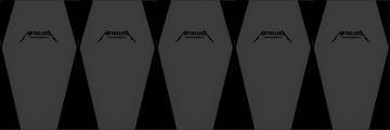
PICK COLLECTION
St. Anger Pick Breakdown
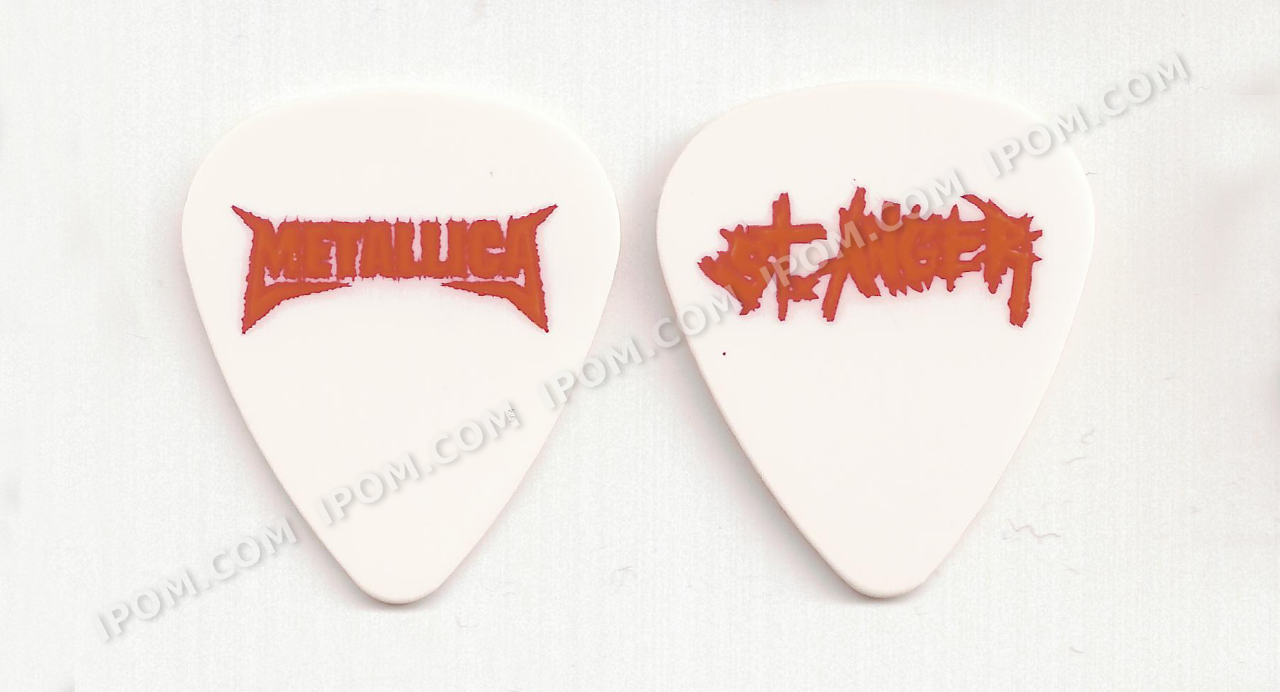
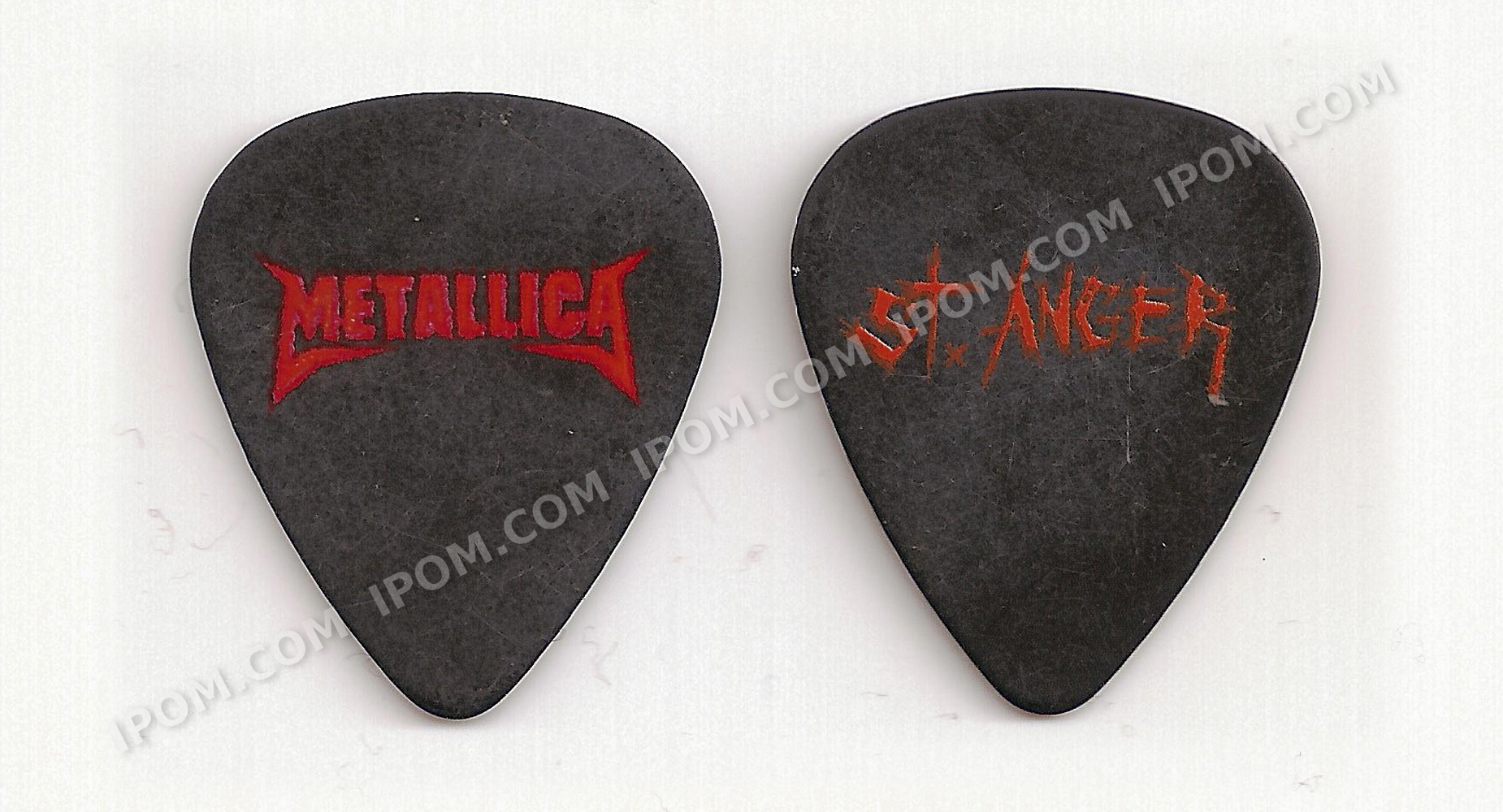
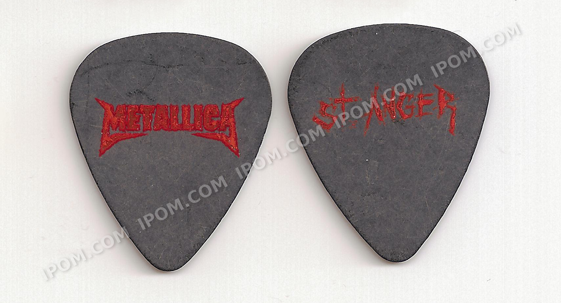
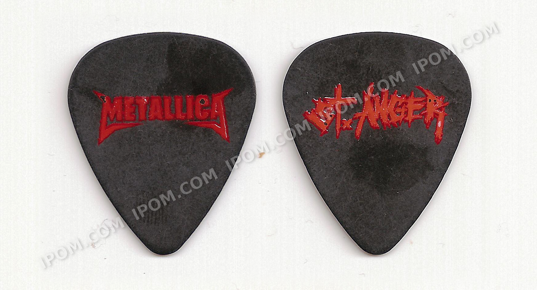
The black St. Anger picks have some subtle variants. Like their white counterparts, there are ones where the Metallica logo has orange text / red outlines and others with red text / orange outlines. On the white ones, the other side matches.
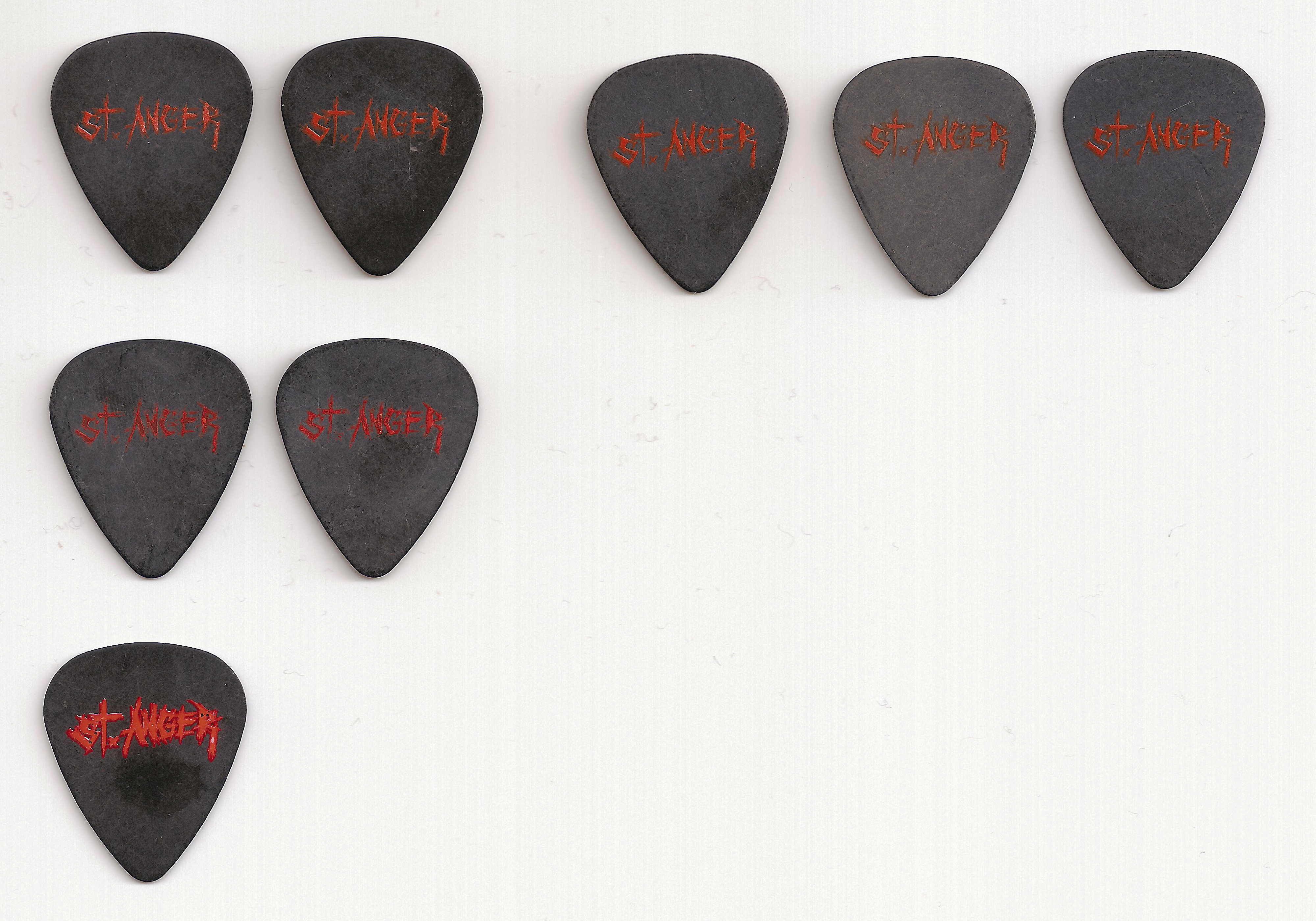
On the black ones, however, the story is a bit different. For the picks where the logo has orange text and a red outline, there are three varients of the "St. Anger" text: light orange, dark orange, and orange with a red outline.
At first, I thought that light and dark orange varieties were just worn-out versions of each other. So I started with a scan of all of them grouped together.
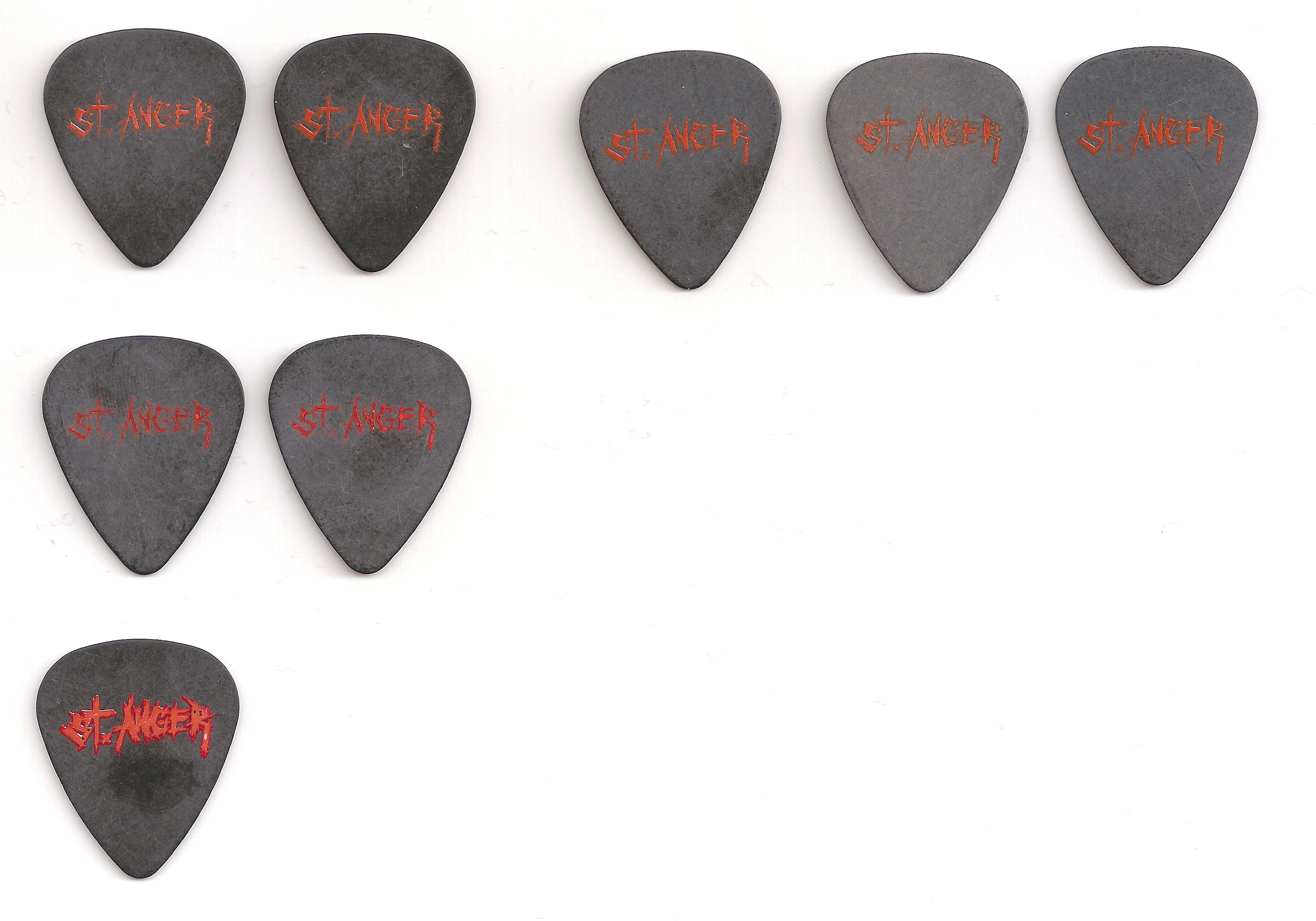
Then I adjusted the gamma, brightness, and contrast on my scanner to try to get a better view.
At this point it seemed a bit like "dark orange" was just chipped away "light orange", so I took a close-ups of the text and put them next to each other so I could compare the areas where the ink was still thick.
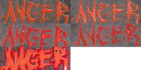
This wasn't definitive. The ink looks slightly different, but not enough to be sure. However, where the ink was scratched off is very different, and tha twas enough to convince me. In the following two images, the left is the middle "bar" of the "E" (where there's lots of ink in all 3 images), and the right image is the top "bar" of the "E" (where at least for "light" and "dark" the ink is mostly scratched off).


This showed me that there are in fact three different varieties.
Please read our Copyright Info